I also spoke to them about what programs to use, and we will most probably end up heavily relying on a website called Canva, which I will explain about more in a later post when I analyze my options for magazine editing programs.
For my magazine, I will need to come up with ideas for the following sections:
1. Layout of spreads
2. Color scheme
3. Types of pictures
4. Story content
Right now, I’m compiling examples of spreads, layouts, and cover images that I want to be my inspiration during my magazine production process.
Here are a few examples I found:
1)
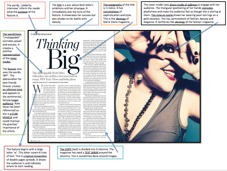
I love the idea of wordplay in my magazine stories! I feel like it gives so much more life to a plain 2D page.
Like is shown in the image, the editors split the text into three columns, which makes the information easily digestible for a reader.
The image pictures the model looking directly at the camera, which directly addresses the reader and grabs his/her attention.
Taking this into account, I will remember to split up my text in two or more columns.
2)
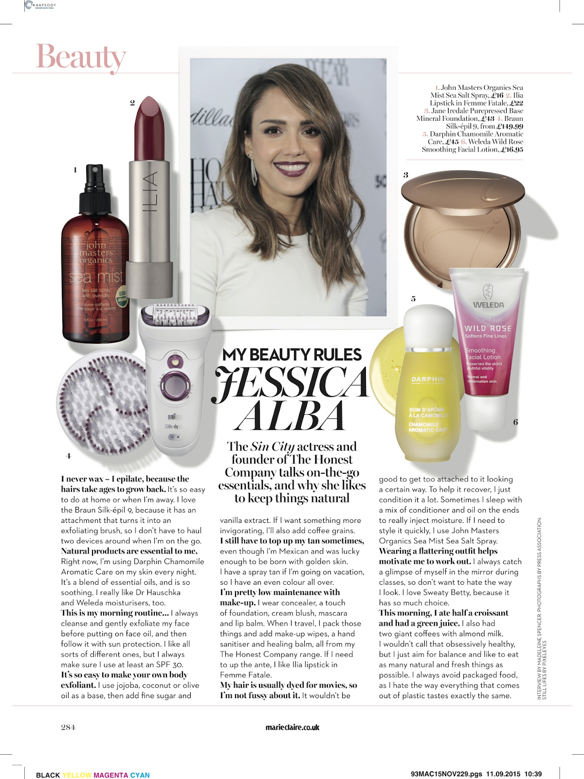
I really need to research the lighting, background, and editing that is needed to take shots like these of makeup products! I have a ring light at home, so I'm hoping this will be useful to take pictures of makeup products or fashion pieces.
I also love the overlaying of products, pictures, and text: I feel like this "collage" of elements gives so much visual interest to the page. (When I was 13, I would always rip these kinds of pages out when I saw them in my Seventeen magazine and stick them to my wall because I loved them so much.)
3)

So much is going on in this page!! And that's why I love it.
There's so much overlaying of model pictures, plants, text, furniture, and more. To me, this colorful and busy spread really grabs the attention of a reader instead of a boring old text and image spread.
(Sidenote: I actually used to make these types of collages! *gasp* When I was little, I loved seeing all the overlaying of products on magazine pages, so I decided to start making collages of outfits and makeup products using an app called Polyvore and Superimpose. Because I'm familiar with these two programs, I will do more research into them to see how I could utilize them for my magazine.)
As you can see, I have two polar opposite interests:
-Simplistic, white, and linear
-Over the top, colorful, and overlapping (like the example above)
Farewell for now!
More content is in the making...
In order of appearance:
CONTENTS AND DOUBLE PAGE SPREAD. (2014, August 20). Retrieved from https://riddlesdownmedia.wordpress.com/year-11-gcse/contents-and-double-page-spread/
Marie Claire / Jessica Alba Interview. (2016, January 02). Retrieved from http://madeleineloves.com/2015/11/01/marie-claire-interview/
Bodieandfou. (n.d.). BODIE and FOU features in the press. Retrieved from https://www.bodieandfou.com/press/
No comments:
Post a Comment