Also, here’s a little sidenote: Seeing as I live in Florida, which is in summer mode probably 360 out of 365 days of the year, I wear any color I want, any season of the year. That said, I do need a little help with knowing what colors and trends are used in the summer and which ones are better left for winter days.
Another sidenote… I was trying to think of a clever name to title this blog post and I thought of “vita in colore”, which means “life in color” in Italian. This made me realize that I love this name for my magazine! Maybe not for my magazine name (but I will further discuss this with my team members) but possibly for a magazine article title. I love how eccentric it is, and I could pair it with a really colorful spread. (Also, if I close my eyes and think of this phrase, I might just imagine myself in Positano lounging next to the aquamarine ocean… But maybe that’s just because its 1 AM and I’m getting delusional…)
So, on to my color researching:
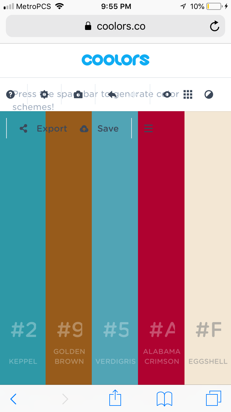
I'm so happy!! I found a really neat website called Coolors.co that lets me create my own color pallete!
I even uploaded a picture of the cover of the July 2017 Marie Claire:
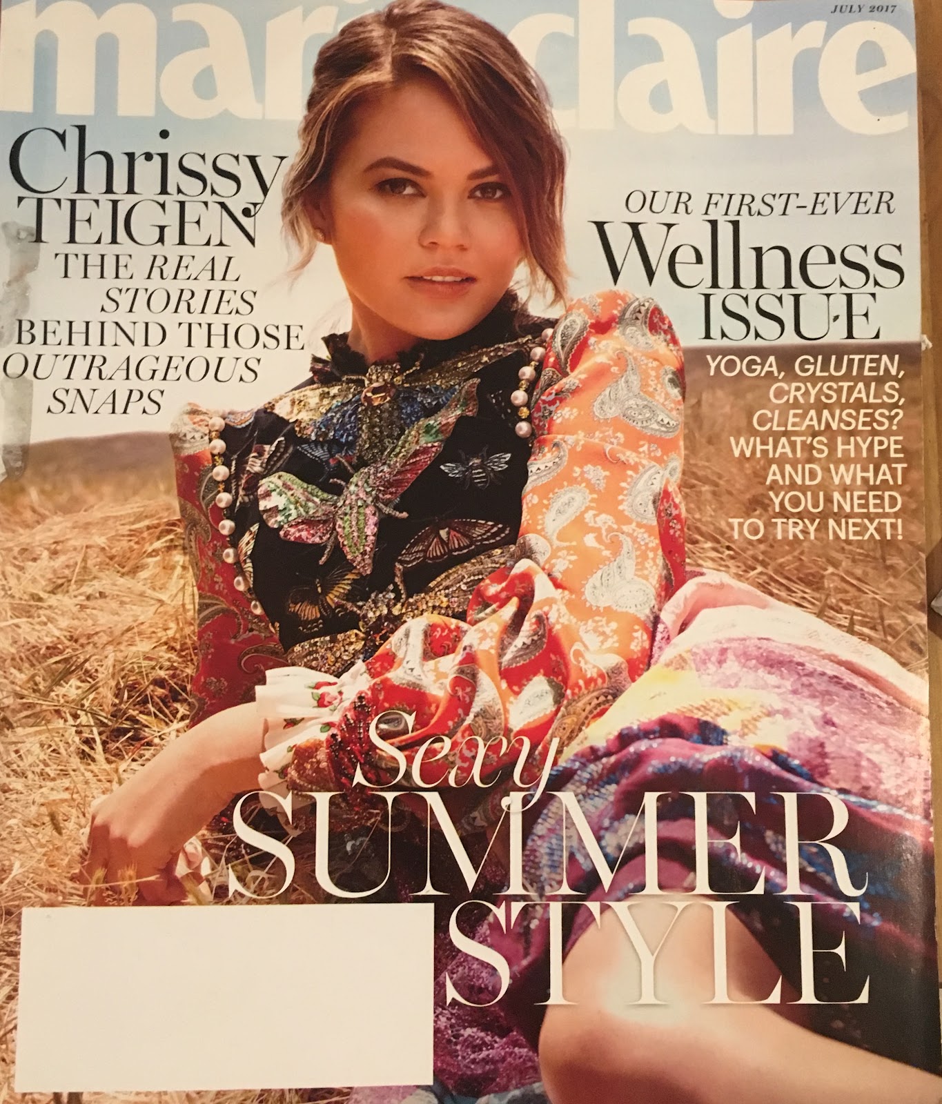
It extracted the main colors of the image and created a color scheme that matched the image, even giving me the color numbers, names, and different shades. Don’t mind the glitches, these are a result of using the website instead of the actual app on my iPhone.
I also uploaded this picture of a page from the same Marie Claire issue, and it gave me this pallete:
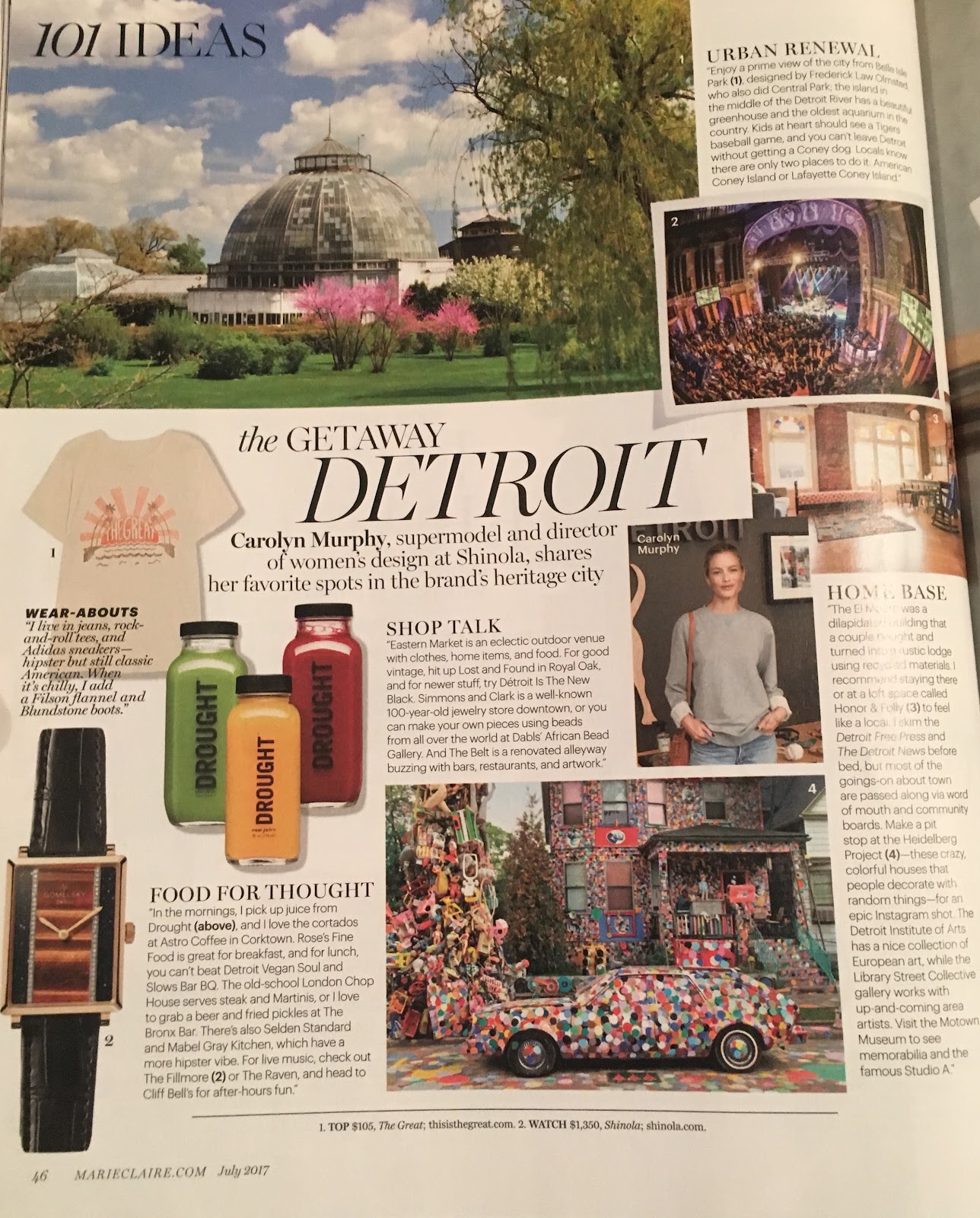
I really liked this website so I could realize what colors are used mainly throughout summer editions of beauty magazines, which are predominantly warm colors, such as reds and oranges, and maybe pops of cold colors such as blues and greens for forests and oceans.
Consequently, I will probably look for a jacket that has these kinds of colors so I can match the style of summer editions.
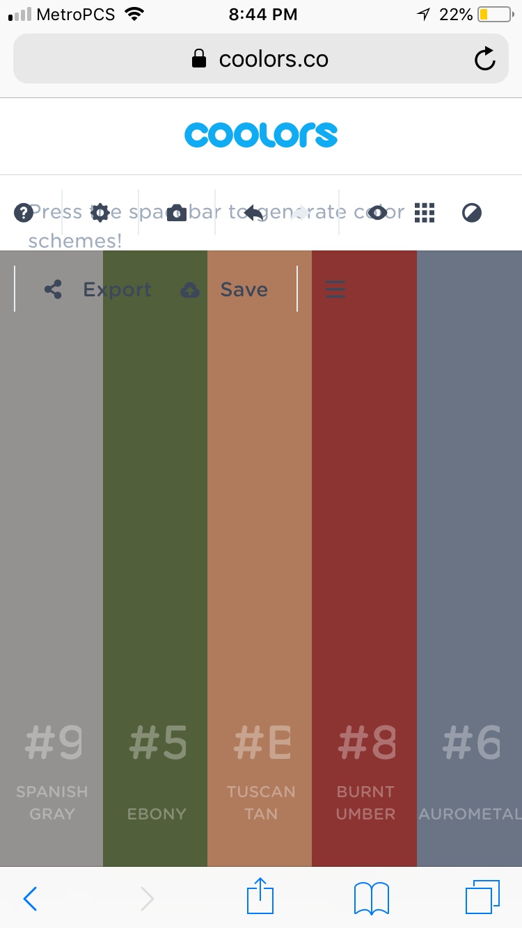
Also, just for fun, I uploaded a screenshot of my Instagram profile, just to see what colors I usually wear and which colors I’m most attracted to. I can use this to see what colors I will be most drawn towards while making my magazine. I dropped this picture into coolors.co:
So...drum roll please...introducing...the Malena Palette!
Anyways, what I found from my research on color is that summer magazines use mostly bright warm colors or light blues and greens, which I will most likely be implementing into my magazine.
No comments:
Post a Comment