Saturday, March 30, 2019

Ad Adventures

Hey guys! So like I mentioned in my last post, I added the picture of the bracelets onto my Canva magazine layout for the ad:


However, I don’t really like how the white text looks on the green background. I feel like it’s a little hard to read. So, I decided to add a little outline behind the text in a different color to hopefully make it stand out:


I'm between pink or purple. I like how the pink matches the pink of the flower, but I feel like the color is too flashy. I also like the purple since I feel like a darker color makes the white stand out more. On Monday I’ll ask Catalina and Valentina what they think is best.

Also, the April 2019 Marie Claire magazine just came in the mail, and since it’s almost summer, I looked through it to see if it had any last minute inspiration for my magazine. I especially looked at the ads this time and I found this one from Bvlgari, which is also of jewelry like my ad is:


I noticed that the pieces were not only displayed on a model, but also on a separate close-up picture. I might implement this in my magazine, but I’ll talk to my group members if they like the idea for their magazine as well.

I also looked at two more ads:


I like the white frame around the model!
Underneath the brand name is the website. 

To finish my ad, I just have to add the website and see what changes my group members recommend. 

Progress has been made, but there is still more to do!
Stay tuned!

Bvlgari ad. (2019, April). Marie Claire, 26(4).
Longchamp ad. (2019, April). Marie Claire, 26(4).
Dolce & Gabbana ad. (2019, April). Marie Claire, 26(4).

Friday, March 29, 2019

Springtime Stresses

I’m back guys! I’m currently writing from my grandma’s kitchen table in Buenos Aires. My stress level concerning this project has honestly been like a rollercoaster: at first, I was relaxing, expecting myself to NOT procrastinate for once during spring break, then I had a full-on freak-out mode during the night (yes, I woke up sweating thinking the project was due the next day...I also had a dream that we were presenting our projects and everyone else’s project was better than mine...). So! What do we conclude from all this psychotic ranting? That I’m a lunatic who needs to relax? Maybe...but no. Instead of stressing myself out even more, I decided to give myself some peace of mind and put myself to work. 

When I visited some friends in the north area of Buenos Aires, I stayed in one of my mom’s friend’s house. When I woke up one morning, I looked out the window, and the day was gorgeous! The past few days had been pretty cold, but that day was perfect for taking pictures. Here is a video and a few pictures that I took of the shooting location, AKA the backyard of the house:


For the past few weeks, I’ve been indecisive on what product I would make my ad on. So I decided to have a few options. I took pictures of my bracelets for a possible ad:


I really like the picture on the left more than the one on the right, but I want to have options.
If these pictures don't work out for some reason, I can use them for pictures for the table of contents corresponding to an article called "32 Jewelry Pieces to Wear for Summertime!"

I also took a few more pictures for some possible table of contents pictures:


I might have this picture correspond to an article called "5 Simple Steps to Taking Care of Your Hair During Hot Summer Days".

These are just a few of my ideas, and now I just have to add the bracelet picture onto the ad and create a layout for this ad.

I'll keep you updated!

Sunday, March 24, 2019

Cover Chaos

Hello guys! I am officially on spring break and I’m having difficulties: I’m happy to be on break, but I’m also a little stressed out because my magazine is always in the back of my mind. Since I’m with my family every day, I don’t really have time to take pictures or brainstorm. I really want to do a little bit every day so that I don’t have so much to do on the last day of the break when I come back from Argentina.

Anyways, I had been a little iffy about my cover image, and I thought it was only me. I looked at it so long that I didn’t even know exactly what I thought about it. So, last Wednesday in class, I decided to ask my two friends Pearse and Raul what their opinions were about the image. They both said they really liked the model’s pose, but they really weren’t a fan of the little artworks in the background. I wasn’t a fan of the artworks either, so I was glad I had another perspective on the matter. I also asked Mrs. Stoklosa, and she told me that the problem wasn’t the lighting or the color of the wall, but the artwork. So, after having three coinciding opinions, I decided to either take a new cover image or alter the picture by taking out the weird artworks.

You might be wondering: “Malena, why don’t you just take a new cover image?” Well, the problem is that right now I don’t have the time or a nice background to take the picture! I might be able to snap a few photos here and there when I have the chance, but I want to make sure I have a Plan B, which is me altering the already-taken picture. Plus, I really like how the model looks in this picture, her pose, and how the jacket appears.

So, I relied on the trusty internet to give me the answers: how do I edit something out of a picture? I found a website called PicMonkey, and I tried out their “clone” feature, where you can clone a part of the background onto another part of the background that you want to cover:


Here's me working some background-disappearing magic:


I was doing all fine and dandy until I encountered the same problem that I encounter while taking selfies: the dreaded lighting.


 As you can see, on the left it looks pretty normal, but then, the colors do not merge together naturally. In other words, I couldn’t blend the color of the lighter background (where the light was hitting) with the darker background (where there was a shadow).
So, being the stubborn person that I am, I tried again:


So, I came to a conclusion:
Since I can’t create the perfect blending effect that is created by the lighting, I might just have to make the entire wall that light grey color, as you can see above. I’m still not finished with it, but I still have some doubts: it might look fake or unnatural, or I won’t be able to make the area of her hair perfect with my blending tool.
I still have hope, however, but if this doesn't work out I will take a new cover image.

Well, this was my dilemma, and I’ll keep you guys updated with how I’ve progressed.
Stay tuned!

Thursday, March 21, 2019

Updates

Hi guys! Right now I’m writing to you from the Miami airport on my way to Buenos Aires, Argentina. I’m really excited about the trip but I’m also really anxious about how I will be progressing with my project. Hopefully, I’ll have time at night at my grandma’s house to start on the draft of the interview and take a few more pictures.

So going along with my previous post, I’m going to be creating a draft table of contents based on my research on other beauty magazines’ TOC. As promised, I talked to my teammates yesterday to see what they preferred for the layout: a picture of a model as the background or singular small pictures throughout the page corresponding to the article titles. They both told me they liked the singular small pictures better, and Valentina showed me her own TOC draft:


I really like her ideas, so I decided to create my draft based on hers. I’m not finished with it, but here’s what it looks like right now:


I just need to add a few more sections and page numbers and then a few draft images, and then I'm done (with the draft at least)!

Here are a few ideas I have for the article titles that I might include in the table of contents:

1) The Skincare Files:
Tips and tricks to have the most "Inta-worthy" skin during humid summer days.
(Include a picture of a girl with a clean, makeup-free face, preferably in a high-key lighting environment or during "golden hour"- AKA when the sun sets) because this is the environment that is common in summer.
2)Making a Statement: How one fearless woman created her own statement pieces, one jacket at a time. PLUS: How to style her denim creations!

Wednesday, March 20, 2019

Tackling the Next Step: Table of Contents

Hello! So yesterday I talked about how I had to get started on creating the table of contents draft layout, and today is the day!

First, I did more (yes, more!) research on beauty/fashion magazine TOC examples, and I saved a few pictures from Google that I really liked. I did an in-depth analysis of this TOC from Marie Claire:


I had previously included this example in one of my blog posts but now I’m actually reviewing every technique and element in this layout so that I can emulate the style and hopefully follow the genre conventions of beauty/fashion magazines.

Here’s a little review of the elements of the page that I made with my right-hand tool (and love of my life) Canva (yes! This powerful website can be used for just about anything!):


Here are a few more examples that I found:


Right now, I’m not sure if I want to have one singular picture of a model as the background of the TOC or several small pictures that correspond to the different story titles in the magazine, like in the last example. I’ll probably discuss this with my group to see what we all prefer so that we can all have the same layouts and styles in all aspects of our magazine brand.

The bottom picture shows a common spread in magazines: one page of the TOC paired with an ad; the TOC pages (about three or four) are almost always split up in beauty/fashion magazines.

To get more inspiration, I’ve been looking at Mrs. Stoklosa’s magazine Pinterest board.

By the way, you should check out my Pinterest board!! This is where I spend most of my time, hibernating under my bed covers. I probably spend way too much time on this platform than I should…

I accumulate all my ideas on this platform, and I even have a board where I have all my ideas for magazine styles, layouts, colors, and images. Other than magazine, I also have room decor ideas, summer goals, outfits, house designs, and more, so feel free to check out these boards as well!!


Marie Claire, 25(5), 18.

Analysis of Magazine Contents Page. (2012, November 12). Retrieved from https://ascarolinece.wordpress.com/2012/11/05/analysis-of-magazine-contents-page/

Magazine Contents page examples. (2013, September 30). Retrieved from https://www.pinterest.com/theresakuhn4/magazine-contents-page-examples/?lp=true

Film, C. (2017, September 12). 2015 Table of Contents & Garnier Fructis Flatiron Express Brazilian Smooth Hair Conditioner, Latina Magazine (2 pages). Retrieved from https://www.flickr.com/photos/29069717@N02/36354967374

Tuesday, March 19, 2019

Don't Judge a (Magazine) By Its Cover...

Happy Tuesday blog readers!

Considering that I have a few pictures already taken, I decided to start on my magazine layout! I really just wanted to give myself some peace of mind because I've been worrying that I don't have enough content, so just seeing my cover and how I'll set up my layout really established what I've accomplished and what I still need to do. 

Since the beginning of this project, I've been anxious to try out Canva for creating a magazine and I finally got to experiment with layouts, colors, text, templates, and more.
Here's a screen recording of me trying out Canva:


Don’t fully judge it yet because it’s not finished, but here is the draft for my magazine cover after a few tweaks here and there:

I honestly love the white border around the cover; I feel like it gives it a professional yet simplistic look. After I added the image, the masthead, and the cover lines, I loved what I had created but I felt that there was an emptiness looming over my creation. So, I decided to play around with the graphics that Canva provides and wah-lah!

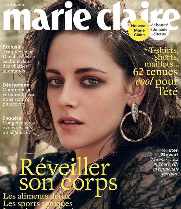
This border reminds me a little of a few indie beauty magazines that I had looked at when doing research on beauty magazines back in the day (three weeks ago):

Image result for indie fashion magazines
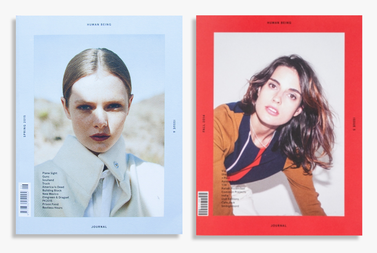
Borders are very prevalent in the indie fashion magazine world.

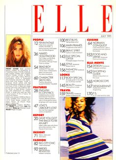
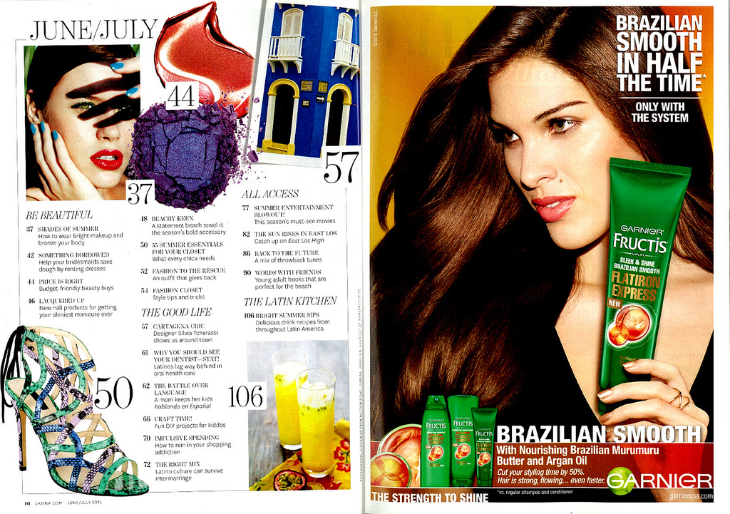
Also, here are pictures of layouts that I've drafted for the rest of the magazine:


I still need to create a draft layout for the ad and the table of contents, but as can be seen, I've been playing around with layouts and different elements for the double page spread. 


First page: Small intro/bio paragraph at the top, three columns of text, two pictures.
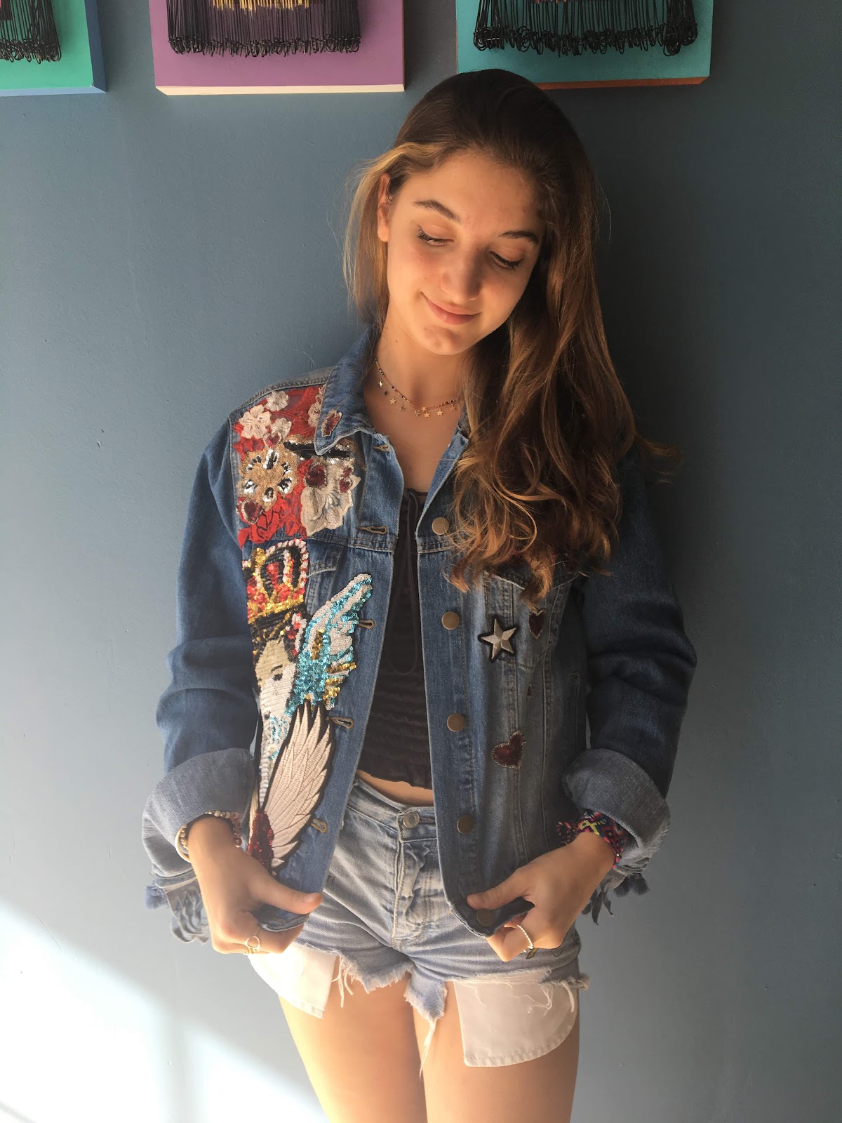
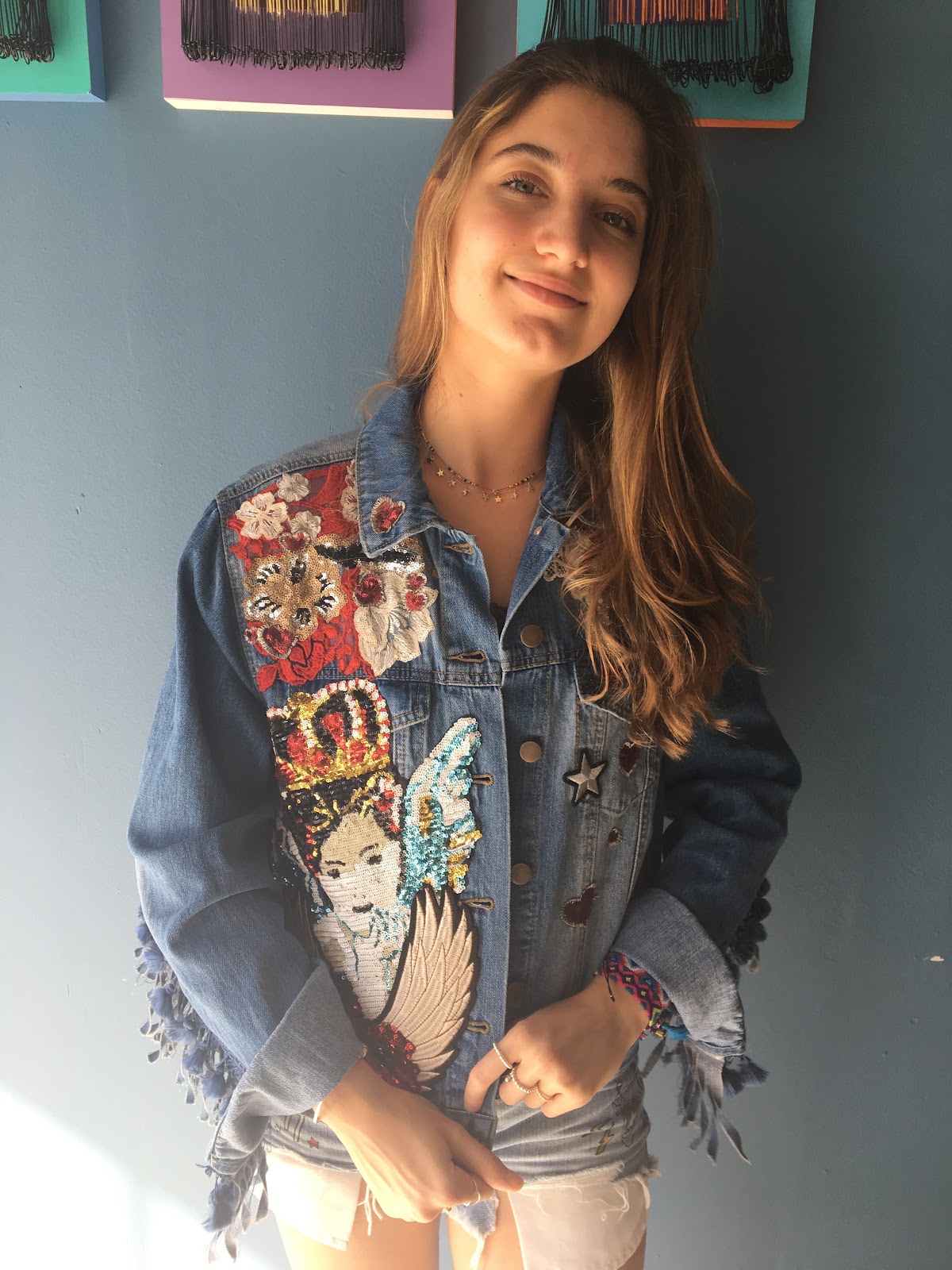
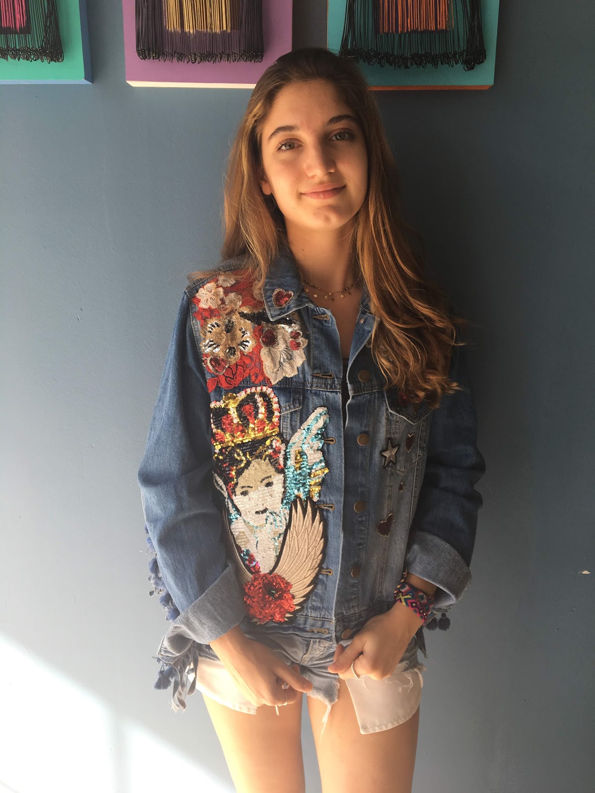
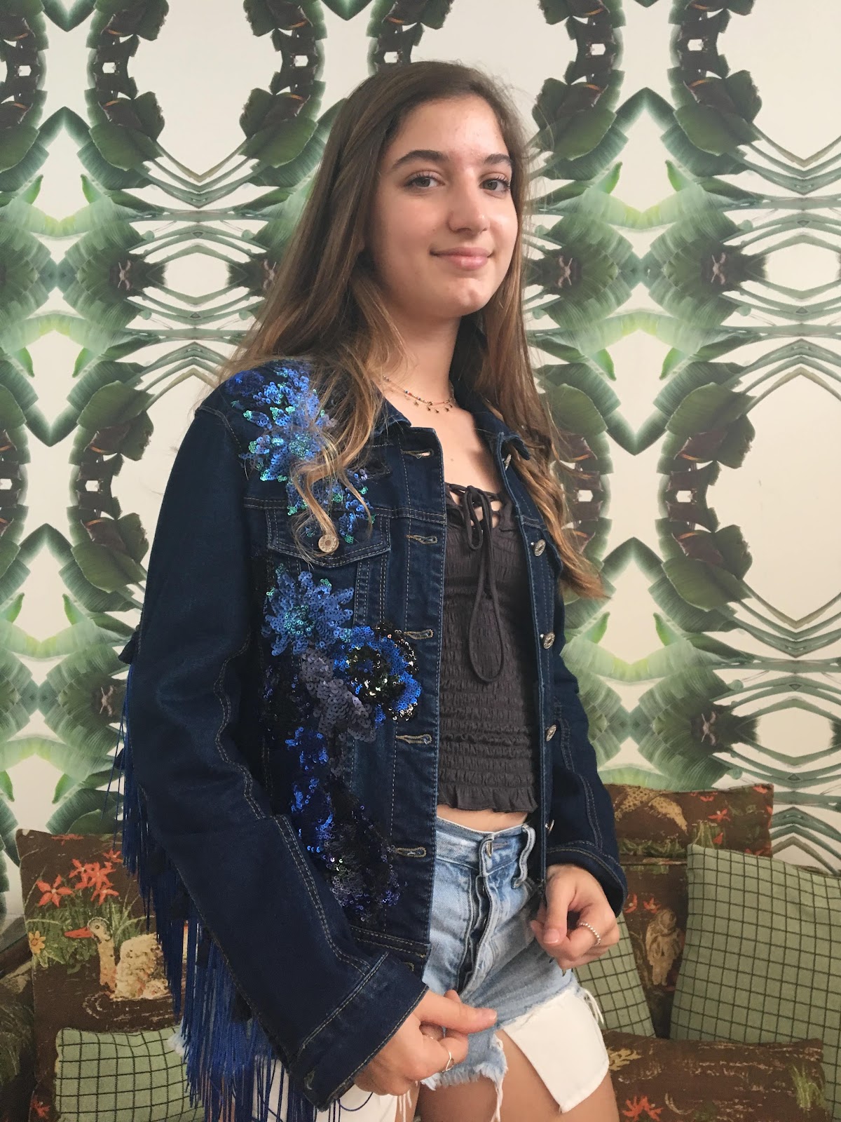
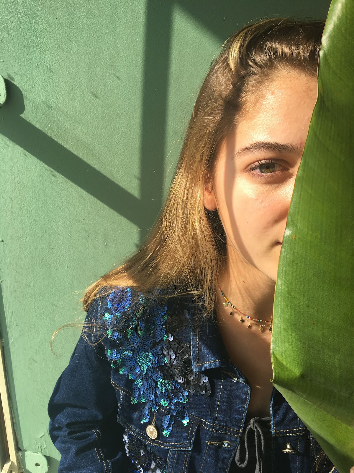
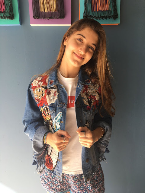
Second page: One more column of text, more pictures with numbers labeled. These pictures will show ways to style my mom's jackets and the numbers will correspond to a small little caption explaining more about each look and clothing piece.
I also used some random pictures of myself and then some pictures of my mom's company that she let me use.

On other news:
Valentina, Catalina, and I are planning on visiting Mrs. Nascimento, who is the interior design teacher at our school because she has a lightbox that we can use for taking pictures of products for our ads. Right now, I’m planning on doing an ad on a perfume bottle because while looking through a few beauty magazines the past two weeks, I found that perfume ads were ubiquitous in the beauty magazine world! I also found a perfect perfume bottle that I can use because the brand in only on one side of the bottle, therefore I’ll only take pictures of the side with no brand.

My group got together today and we played around with Canva; we really liked the font Abril Fatface for our masthead. Valentina also downloaded the font “Vogue” from Dafont.com, and we really liked the simplistic and professional look of it.

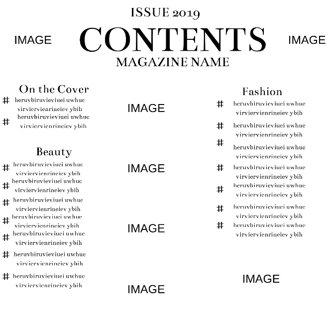
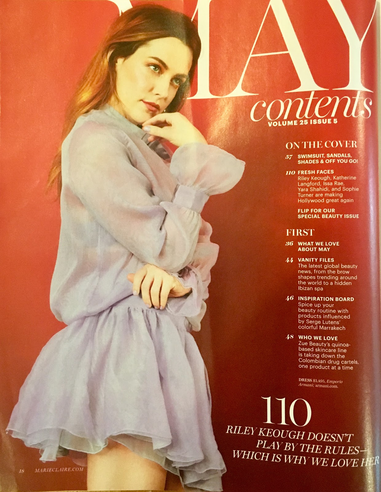
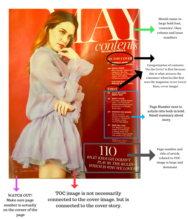
I'm still brainstorming more ideas for the table of contents based on other beauty magazines, so stay tuned for more about my magazine journey!

Berg, S. F. (2016, February). 10 independent fashion magazines. Retrieved from https://www.stackmagazines.com/everything/10-independent-fashion-magazines/

Sunday, March 17, 2019

Shooting day reflection!

Hi guys! So I wanted to talk more about the pictures that I took yesterday and give you guys more information about where and how I took them.

Like I told you in my one of my last blog posts, I was planning on shooting pictures of my sister in the Miami Design District. However, when I visited my mom’s new studio, I realized how cool that location was to shoot pictures in: there were awesome backgrounds and the lighting in some parts was beautiful!

So, I decided to save my family the trip (and the traffic) to downtown Miami and use what could! I grabbed two of my mom’s jackets and a few pieces from my closet and took a tour of the building with my sister. Here is a video that I took of me directing (aka BOSSING) my sister around, which is my favorite daily activity anyways:


If it looks like I'm slightly yelling at her, it's because I am...


Here are some pictures that my sister took of me:


I really like this picture above!! I love how we used the leaf for more visual apeal, but I’m not sure how I would include it in the magazine.


In the end, I really liked how this picture of my sister for the front cover image:


The lighting might be a little weird, but I’m planning to do a blog post on how I edit it with Lightroom and adding draft cover lines and a masthead with Canva. 

DO NOT BE FOOLED: This may look like me, but I promise it's not!! 
I was recording a video of me taking pictures of my sister in this location, but then my phone decided to overheat in the sun, restart, and delete my video- *silently weeping*. But! I will persevere! I still have the video of me taking pictures of my sister on the couch.

Also, I will be in Argentina during spring break, and my partner Valentina (also from Argentina) recommended two really pretty spots in Buenos Aires to visit to take pictures!! If I get around to go during the week I’m visiting, I'll definitely take some more pictures so I can have more options.

Thanks for reading!

Saturday, March 16, 2019

Finally shooting day! Hip Hip Hooray!

Hey guys! So recently I’ve been a little worried about my magazine because I’ve had no time to take pictures for my project or interview my mom. Since it’s the end of the quarter, I’ve had a lot of work to do and I’ve basically had no free weekends. With all the planning and research I was doing, I was aching to finally get hands-on with the project and see what all the weeks of planning would take me. So today, after around a month of wishful thinking and planning, I FINALLY had the time to take pictures of my sister for my magazine!! *internal “Celebration” song comes on*

Today, my mom was moving her showroom studio from a consignment shop in Miami to a coworking space near also in the Miami area. So, while I was helping her move her merchandise and furniture, I took advantage of the moment and took some pics! My mom had shown me the coworking space through pictures, but I was actually amazed when I visited the place in real life!

The building was an actual maze. My sister and I actually got lost when we separated from each other while taking pictures. All of the walls were covered in art and beautiful quotes that made my eyes glaze over with happy tears...I had found the perfect location to take pictures of my model. Yet, I realized that a lot of the artwork had the names of the artists so I couldn't use these as backgrounds since I didn't have their consent to use their work. Also, I couldn’t find the owner to ask him if I had permission to shoot in their building, so I found that the safest bet was to use walls that had no significant copyrighted or branded artwork. Another obstacle I encountered was that I was in a time crunch: my parents were already packing up to leave so I convinced them to give me another half hour to find cool wallpapers and take pictures.

With all this said, I’m really pleased with how the pictures turned out! My sister was actually super compliant to my annoyingly picky demands (surprisingly) and even let me use her phone when mine ran out of storage (that’s how many pictures I took today…).

Soo...without further ado, here are some of today's UNEDITED shots!! :


This is the one that I’m considering using for the cover image:


The model is looking at the camera, which Mrs. Stoklosa had said was vital for a magazine cover image and which I had already noticed was a universal feature of cover images in all beauty magazines.

My sister is also wearing one of my mom’s jackets, which hints at what the cover story will be about: my mom’s company and how to style her jackets in different ways! I did this because I really wanted the cover image to relate to the cover story in some way. Here is my mess of props that I used for the photoshoot:


Sorry for the dark lighting!

Big thanks to my mom for letting me experiment with multiple of her jackets and giving consent to having her brand in my magazine.

To give you guys a little context, here are the locations in the coworking space that I shot pictures at:


As you can see, the area has amazing lighting, especially near the windows, and has so many cool wallpapers for backdrops!

Overall, I'm really happy with how much I progressed with the project in the past few days!

Now I just need to:
-Edit my pictures
-Create a layout draft
-Interview my mom
-Write the article
-Take pictures for the ads
-Create ads with Canva

Tour. (n.d.). Retrieved from http://madeatthecitadel.com/tour/

Friday, March 15, 2019

Say cheese!

I’m back! This time with different poses that a lot of beauty magazines use not only for their front covers but also for showing clothes or makeup on models.

Since I am certainly no expert on posing or facial expressions, I wanted to compile some research on the types of pictures that different beauty magazines utilize throughout their publications so I can emulate the style of these famous magazines. 


Most magazine cover images focus more on the actual famous model more than on the clothes or makeup on the model because the publication will be conducting an interview on him/her. So, I found that a lot of the cover images on beauty/fashion magazines had mid shots or close-up shots.

Here are some examples:


Here, the model is looking straight at the camera in a close-up shot.


This is one of my favorite cover images that I found! Why?

First of all, I like how the camera is farther away from Camila Mendez so that almost all of her outfit is shown. I want to imitate this style so that I can fully show my mom’s jacket which is what the cover story will be about.

Also, since I am working with inexperienced, camera-shy models, it might be hard for them to pose seriously if a camera is right in front of their faces. By placing the camera farther away, the model can be more confident and not as intimidated with a lens in her face.

Second, I how the model here is carrying a little flower in her hand. Did you notice this little detail?

Why do I love it? Because in my experience, the hardest part of posing is “what the heck do with my hands?!” So, having an object like sunglasses or a hat can not only add visual appeal to the image, but it can also help my model interact with her fashion pieces so that she does not feel static and awkward.

This cover also gave me an idea of how to style my mom’s jacket: instead of the conventional way through the arms, the jacket can be simply placed over the shoulders to give it more originality.

Some more examples that I liked:


TeamKristenSite. (2016, April 28). Kristen on the cover of Marie Claire France Interview - June 2016. Retrieved from http://teamkristensite.blogspot.com/2016/04/kristen-on-cover-of-marie-claire-france.html
Jamaluddin, L. (2018, May 28). Marie Claire June 2018. Retrieved from http://marieclaire.com.my/cover/marie-claire-june-2018/
CAMILA CABELLO in Vogue Magazine, Mexico March 2018 Issue. (2018, February 27). Retrieved from https://www.hawtcelebs.com/camila-cabello-in-vogue-magazine-mexico-march-2018-issue/
Barnaby. (2017, June 30). The Formula for Happiness - Seventeen Magazine Vs My Mom. Retrieved from https://personalfinanceking.com/formula-happiness-seventeen-magazine-vs-mom/

Wednesday, March 13, 2019

BE YOUR OWN MUSE

Welcome back!

So, after asking a few of my friends to be my models, I encountered some...problems.

First of all, the unanimous response to my question was “But how will I pose?”

And to be honest, I didn’t even know. What I do know, however, was that I don’t want my model to look awkward or uncomfortable (for obvious reasons). Thus, my friends refused my offer and guiltily muttered: “I’m sorry...but I’m just gonna look really awkward!” So, because I myself am scared to be the center of attention in front of a camera, doing poses, changing positions, etc, I let my friends go unscathed (for now).

Second, I’m planning on taking pictures in Miami this weekend, and a lot of my friends have either volleyball tournaments or volunteering so they won’t be able to come with me to the picture-taking locations. Wandering around the desolate school hallways thinking of who my model would be, I had a mini realization.

So...what did I decide?

SURPRISE! I’m going to be own model (actually two of me)...

Let me explain:

So, as I mentioned in the introduction of my blog, I have a twin sister, Catalina, with whom I am doing the project. Since my sister and I are basically joined at the hip, we will be going to Miami together this weekend, so it’s the perfect opportunity for me to use her (that sounds worse than it actually is) for model material. I will be directing her posture, movement, and poses throughout my picture taking process.

However, I will also be the model, because there are some poses that I can imagine in my head would work perfectly, but I can’t really verbalize them to explain to my sister (although some claim we have twin telepathy…).

So, although I was stressed throughout last weekend and the beginning of this week wondering who my model will be, I have finally reached a decision for my model(s): Malena + Clone Malena.

Who said you can’t be your own star and producer?

Although I’m intimidated of replicating Gigi Hadid’s poses and outfits… I accept the challenge.

I just have a few worries:
I reallyyy want to have variety in my pictures, and having identical-looking models over and over again doesn't help.

Therefore, I’m going to have to embellish my looks and my sister’s looks so we look different and so there’s some variety in the pictures: colorful glasses, jeans, makeup, etc.
Also, I’m going to be using pictures of myself and Catalina for my mom’s jackets segments, which are the front cover image and the images embedded in the double page spread (interview). Yet, I still want to find different models for my table of contents pictures and ad, if I needed.

So here’s the plan:

Saturday, March 16th:

1) Go to Miami with my mom and sister and take pictures in “The Citadel” restaurant mentioned on my last blog post with the really pretty walls and architecture, and possibly find more cute areas to take pictures around that area.

2) Try to convince my parents to go to this magnificent place:


The luxurious Miami Design District. Guys. Look at this place! It’s basically pleading to be on the front cover of a magazine!


So, I want to kind of emulate the style of this picture that I took a few months ago. Instead of having me awkwardly standing in front of it, I want to take a low angle of the model and the model looking down at the camera, with the bubble structure in the background. 

Also instead of me smiling rigidly at the camera, I will (attempt to) *gasp* not smile and look more serious and professional since this is usually what I observed from cover images in beauty magazines such as Marie Claire and Vogue.

I’m not sure if it will work out because the outfit might not be displayed as much with the low angle, but I will see what magic I can work.

Fingers crossed that the locations all go as planned and that the WEATHER IS NICE in bipolar Flordia. Very important.

Farewell for now,
Malena

About Us. (n.d.). Retrieved from https://www.miamidesigndistrict.net/about/