Thursday, February 28, 2019

I can see clearly now, the rain is gone...

     Today I had a group meeting with my classmates and it was more helpful than I anticipated!
     Although we had all different genres (some were doing film openings, some magazines), we were able to bounce ideas off each other. 


     Sophie, one of my peers, is also doing a magazine, but she is focusing more on makeup products and tutorials. When I shared my ideas and plans with her, she told me that she had one main problem, and she asked me if I had any ideas to deal with this issue. Sophie told me that she was planning on making her magazine cover be a girl with a full face of makeup, but was confused as to how this cover image would relate to the cover story. I honestly hadn’t thought about this for my magazine before she mentioned it, but I replied that the model could be the actual makeup artist, and the cover story could be of the model talking about her experiences and obstacles with makeup and making a living off doing people’s makeup. This is what I had planned to do for my magazine, but relating to fashion more than makeup.

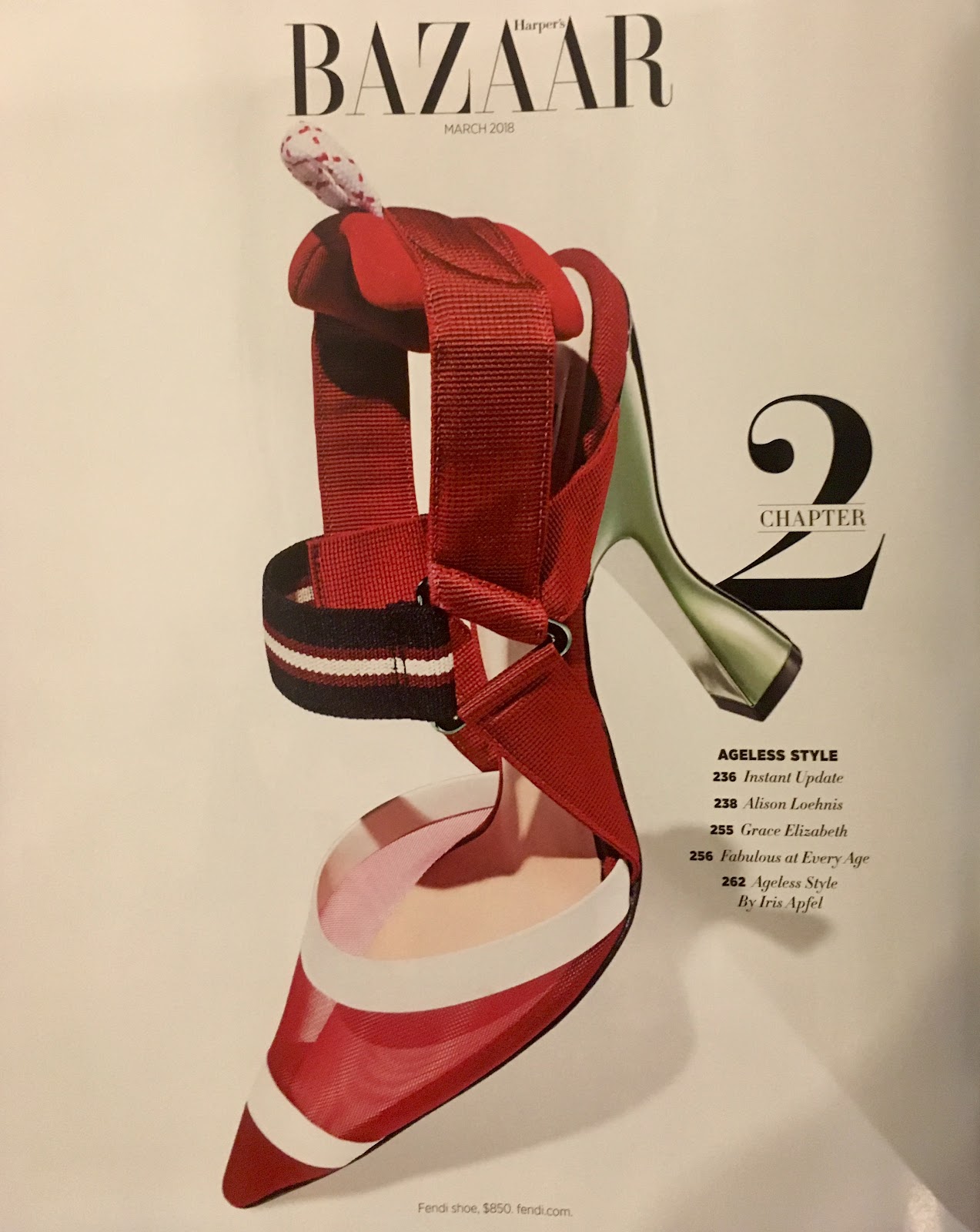
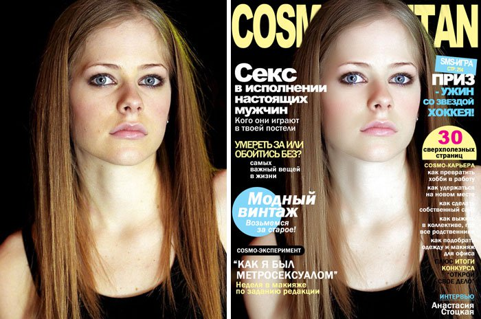
     Mrs. Stoklosa then advised us that a cover image does not necessarily have to be related to the cover story, or the main story in a magazine. In fact, she added, several magazines did not have cover images that were related to the main story, but instead of a famous actor to attract consumers.

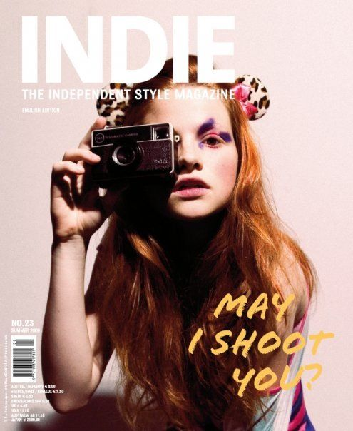
     However, it was hard to find beauty magazines that had unrelated cover images when I searched online today. One of the few magazines that had a model unrelated to the cover story was this indie magazine:


     Thus, I think it might be best for us to use a model who will relate back to another story in the magazine because a consumer might be more interested to buy a magazine if he/she sees a glimpse of the content about the model on the cover.

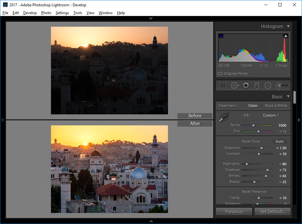
     I also talked to my teammate Matt, who is really talented in photography and very knowledgable about editing software and programs. He recommended a program called Lightroom, which I had heard of before, but I had never looked into the details. Showing me what he was editing on his computer, he showed me before and after pictures that he had taken of his friend, and the results were amazing! He explained that the program offers “presets”, which are basically layers of alterations to the photo (higher brightness, higher saturation, less contrast, etc), many created by professional photographers. So, if you like the photos of a particular photographer, you can buy his/her presets and make your pictures look like theirs. Which one click, raw pictures all so much brighter and professional, which is hard to do if I simply edit pictures on an iPhone. Most importantly, the pictures all had a consistent look, which is really important for my group’s three different magazines, since they all have to follow a consistent theme and style. However, the program and the presents are fairly costly, and I am not sure I have the money to afford it. I know the iPhone Lightroom version is free, which might be a better alternative than the paid application...I will continue to play with the app to see if it could be useful for our magazine’s photos. (Check out the before and after of the image underneath!)


Image result for lightroom Image result for lightroom before and after     Overall, I was extremely pleased with all the ideas my group members provided me with: they saw my ideas and my blog with fresh eyes and gave me new approaches to the plans I already had. Logging off for now!


Malena


In order of appearance:
INDIE magazine. | Indie Magazine | Pinterest | Magazine, Magazine design and Editorial design. (n.d.). Retrieved from https://www.pinterest.com/pin/354869645609725282/?lp=true

Adobe Lightroom. (2019, February 28). Retrieved from https://en.wikipedia.org/wiki/Adobe_Lightroom

Mansurov, N. (2017, July 6). Lightroom Before and After. Retrieved from https://www.google.com/search?rlz=1C5CHFA_enUS724US724&biw=1440&bih=789&tbm=isch&sa=1&ei=YKJ8XLS5MoG45gKcioGoCw&q=lightroom before and after&oq=lightroom before and&gs_l=img.1.0.0l4j0i8i30l4j0i24l2.56220.57577..58660...0.0..0.88.923.11......1....1..gws-wiz-img.......0i67j0i5i30.mm14dj_c6co#imgrc=Cho2x6OHnTcDbM:

Sunday, February 24, 2019

And did I mention research?

Okay. So I currently have about 50 tabs open in my Google Chrome browser and my OCD is killing me. BUT! I will persevere and continue to investigate more about the beauty/fashion magazine world.

After flipping through all of the beauty/fashion magazines I could find in my house, I think I’ve found a brand that I really gravitate towards, and that is Marie Claire.

I also flipped through Harper’s Bazaar and let’s not say I hated the layout, but I was just annoyed by it. First of all, I was flipping through the magazine for 76 pages until I found some sort of text longer than a sentence. The pages before this were all ads; no text explaining how to style a piece, no context to the images. I didn’t really enjoy this because I felt bored by the similar layouts and portraits of the images. Secondly, I also didn’t like that the beginning of the table of contents was literally on page 116! To me, this is too late into a magazine because I, as a consumer, like to read through the table of contents before I start actually reading just so I can have a heads-up of what’s coming (but maybe that’s just me).

However, there were a few elements that I really liked from Harper’s Bazaar. The layout of the table of contents was so clean and easy to read! I also love how the words are slanted to the edge of the purse, which I thought created an interesting visual interest. The page numbers are bolded and the title of the article is right next to it’s corresponding page number, which is super easy to read and is consistent throughout the page and next page of the table of contents.

Marie Claire Case Study: However, looking at all the magazines, I was intrigued the most by Marie Claire. To start off, I also really liked the table of contents for this issue; it was, similar to Harper’s Bazaar, very clean and easy to follow:


All of the TOC pages were spread out, with an ad next to it, like is shown in the third image. I think that for my magazine, instead of having the table of contents text on top of an image of a clothing item, like Harper’s Bazaar’s example does, I will display my TOC on top of a picture of a model. In addition, I also really like how Marie Claire’s TOC has a bigger text font for the article page number and title that is related to its background. For example, for the second image, “57 Accessories That Shine Like the Sun” is in a bigger font because it corresponds to the background of a model with shining accessories.

I also loved the photography of this magazine; I really enjoyed how the images played with lighting and movement. Take a look:


On the top image, the way the light hits the model’s eye creates a really interesting visual appeal: her eye’s and red dress’s color pop out, and it creates an illusion of mystery. On the bottom image, the model is not simply shot standing up; the girl is jumping up in the air in a red dress, contrasting the bright yellow background. The model is moving around, creating visual appeal to the image, which might hint at her fun personality. [Sidenote: I really want to incorporate the element of movement into my magazine’s photography, especially on the images of a person that I interview. Instead of having their faces completely turned towards the camera, the interviewee could be doing something they are passionate about, or be walking around. Also, I love how these photographs work with light so I might incorporate images with different lighting colors and locations for my magazine.] Secondly, I also think the layouts of the double page spreads are super simple and easy to read: the model’s age, hometown, current residence, and more are listed on the side of the image. In addition, the name of the interviewee is displayed in a bold font vertically. For my magazine, I want to have spreads that are visually appealing, so I love the way the title is shown vertically, and not in the usual horizontal layout.


So! The next part I really liked from this Marie Claire issue was its little interactive quiz (I know, I know, I’m still a child at heart):
 
I think this quiz allows the audience to really interact with the magazine’s content, instead of just simply reading a paragraph. I think I want to embed this into my magazine maybe so that the audience can find their perfect makeup brand or clothing style...I’m still not sure yet.

Lastly, I seriously LOVED the “inspiration boards” that each issue includes. It’s basically a page that features products and images that are inspired by a specific word, like “water” or “Marrakech”. Each time I look at one of these spreads I am literally overcome with wanderlust and want to catch the next plane to Europe. But, alas, I am still much too young and must continue my life in high school…Also, there is one thing that I love (almost) more than my two dogs, and that is Pinterest. And this “inspiration board” spread, ladies and gentlemen, is a real-life Pinterest board!


(I would pin 100 of these onto my bedroom wall…) As you can tell from my aggressive excitement, I really want to embed an inspiration board into my beauty magazine; maybe with a collage of different makeup products and pictures of places in Miami inspired by these products... I’m not sure yet.

Well! I’m done ranting for today. Hope you enjoyed this post! Talk to you next time, and I’ll keep crazily digging through Marie Claire magazines to find more inspiration board pages to stimulate my creativity...

In order of appearance:Table of Contents. (2018, March). Harper's Bazaar, 116-116. Table of Contents. (2018, March). Harper's Bazaar, 126-126. MAY contents. (2018, May). Marie Claire, 25(5), 18. MAY contents. (2018, May). Marie Claire, 25(5), 27. MAY contents. (2018, May). Marie Claire, 25(5), 23. Felsenthal, J. (2018, May). Riley. Marie Claire, 25(5), 114-115. Felsenthal, J. (2018, May). Sophie. Marie Claire, 25(5), 116-117. What’s Your Eyewear Personality?. (2018, May). Marie Claire, 25(5), 66. Flaherty, E. (2018, May). Inspiration Board: Marrakech. Marie Claire, 25(5), 46. Flaherty, E. (date unknown). Inspiration Board: Water. Marie Claire, 116.

Saturday, February 23, 2019

So. Much. RESEARCH.

Research is key! And that is the #1 lesson I have learned from this course. From a specific target audience (age, gender, socioeconomic status), to conventions of beauty magazines, it’s better to have more research and be knowledgable before we make our decisions. If we have research, then we don’t have to go back and do more when we’re actually creating our magazine.
So! Valentina, Catalina, and I got together yesterday in class and we had a genuine talk, weighing our options:
First, we all love the travel genre since we all recently traveled out of the country and have great pictures for our magazine, but these pictures were taken before we started taking AICE Media Studies. Thus, our shots have no technique and won’t add much to our magazine. (While taking the photo, I thought they were so beautiful! But now that I have more knowledge after taking this course, I realize the pictures had no technique...) Also, we could theoretically still do a travel magazine and create content about Ft. Lauderdale or Miami, but I just don’t want our travel magazine to look the same as everyone else’s magazine who is taking the course. So! What is the conclusion after all this ranting? We are not doing a travel magazine after all.

But! My group and I were discussing and we all realized we love beauty: Valentina is really good at and knowledgable about the makeup world, Catalina and I really love the fashion industry, and we all are super interested in skin and hair care. After researching more about the beauty/fashion genre together, we were all really convinced and decided this was the way to go.

I’m honestly so excited… I’ve looked at my mom’s fashion/beauty magazines since I was little and I’ve always enjoyed looking at the colorful spreads. Today, I dug out all of my mom’s fashion/beauty magazines from her basket and analyzed which ones I liked the most, what content this genre included, and what techniques I want to incorporate into my project.
I’m planning on making a case study blog post on some specific magazine issues I really enjoyed later on, but right now I’m still doing even more extensive research on the fashion/beauty genre.

Now for the research:
I did do a lot of research on the beauty genre on one of my previous blog posts, but I feel like I focused mainly on magazines that contain content on makeup, hair, and skin tips. So, for this blog post, I decided to widen my research into not only beauty but also fashion. This is because a lot of the magazines that have beauty recommendations also have fashion tips, like Vogue, Marie Claire, and Elle.
Some quick facts about the beauty/fashion genre:
-Target audience: 16-35-year-old women, with a middle to high socioeconomic status. Consequently, the models throughout the magazine and on the front cover especially are in the middle of this age range, about 20-35 years old. This is so that the magazine can appeal to the target audience; when they see this magazine on a bookshelf or at a grocery store, they will buy a magazine that they think is relatable to themselves or features a model/actress similar in age.
-Content: fashion trends, new styles, up-and-coming designers, interviews, skincare, makeup tips, and women’s issues. Many beauty magazines, including Marie Claire and Vogue, include interviews with the model from the front cover, or even inspiration/ mood boards. The idea of having an interview, with genuine questions and a raw picture is something I’d really like to incorporate into my edition of our group’s magazine. I’m thinking of interviewing my mom or maybe even a girl from school. Like the example shown below, I want to include a double page spread with a raw picture of the person being interviewed and a page with the text, with all the questions and answers. Here is an example that I found from Marie Claire:

-Representation: Models are usually shown as perfect, with idealistic bodies. In fact, several magazine companies are known to photoshop, airbrush, and filter model pictures to seem more “appealing” and “attractive”.
Look at how edited this picture is!
In the past few years, however, women’s rights and the #MeToo movement have given rise to a women’s rights movement, so magazines articles have evolved as a result. Several magazine issues have written articles on the fight for women’s equality in the workplace, columns on women who have made a change in the world, and pictures with models having their hair and body in their natural and raw style. I love this element for my magazine; I really don’t want to have edited pictures of my models and give women an unrealistic view of what a woman should look like (which I have experienced when looking at seemingly “perfect” models on magazine covers). Thus, my magazine pictures will feature raw, unedited pictures of women.
As can be seen on the front cover, this beauty magazine, Cosmopolitan, includes articles on the #MeToo movement and about a plus size, confident model. Although the masthead is in the signature pink Cosmopolitan color, the rest of the cover image completely breaks the conventions of typical beauty/fashion magazines. The model, normally “slim” and society’s definition of “attractive”, appears as a plus-size supermodel. Instead of talking about a fashion or beauty trend, the magazine decides to talk about how a plus size model is turning her back on her “haters”.

This element is something I want to incorporate into my magazine; through an interview, I really want to talk to a woman who has overcome obstacles to do something greater than herself. I’m thinking about interviewing my mom, who has a fashion brand, but I will talk about this in a blog post later on when my ideas are settled out!

-Distribution: Most of the beauty/fashion magazines sold are through print subscription services. Although there are still millions of magazines sold through online purchases (downloading on a tablet) and non-subscription purchases (like buying a magazine in a grocery store), the leading circulation of the magazine is because of consumers receiving the magazine in the mail through a subscription.
In fact, Harper’s Bazaar Magazine’s distribution in 2013 was 81. 2% because of paid and verified subscriptions (with 78.3% being in print format) and 16.8% from single copy sales. I acquired this information from a really useful slideshow about genre and representations in fashion magazines. This presentation was so handy in providing me statistics about fashion magazines’ target audience and demographics (including gender, median age, relationship status, etc). I will continue to reference this presentation for my magazine!

Whew! I feel like this blog post was all over the place (like my thoughts) but I had a lot on my mind and I just wanted to research the genre fully. I will probably continue my research, and I already have plans underway to create a blog post on a case study on a specific beauty/fashion magazine brand (probably Marie Claire), a blog post on ideas for my magazine (layouts, color schemes, content ideas), and also more research on what program I’ll be using to make my magazine. Next blog post, I think I'll organize my crazy thoughts before I start writing (this one was pretty long). I will continue to flip through magazines and more magazines...and still more magazines...
Thanks for reading!
Till next time,
Malena

In order of appearance:1) Larissa Kwakernaak, L. (n.d.). Interview spread | Magazine Design Inspiration | Pinterest | Magazine design, Magazine and Magazine design inspiration. Retrieved from https://www.pinterest.com/pin/73887250115216247/?lp=true2) Kennedy, M. (n.d) Photos That Show the Before and After Effects of Photoshop On Hollywood's Biggest Stars. Retrieved from https://twentytwowords.com/photos-that-show-the-before-and-after-effects-of-photoshop-on-hollywoods-biggest-stars/3) Harvey-Jenner, C. (2018, September 06). This blogger pointed out the double standard of criticizing Tess Holliday's Cosmopolitan cover. Retrieved from https://www.cosmopolitan.com/uk/body/a22993945/stephanie-yeboah-double-standard-tess-holliday-cosmopolitan-cover-criticism/4) Roberts, H. (2013, December 18). Fashion magazine - Genre and Representations. Retrieved from https://www.slideshare.net/hayleylou11/fashion-magazine-genre-and-representations

Wednesday, February 13, 2019

Music Marketing Campaign Reflection!

Hello! Welcome back to my blog! A lot of things happened while I was away...My group and I made a music video and a marketing campaign for a band from scratch, and then presented it to the class! Yes... the experience was scary and stressful but fun and eye-opening at the same time. It really got my creative juices flowing, and now I have a bunch of ideas for our magazine floating in my head...Anyways, here I have a reflection of my project! Enjoy!

During the course of three weeks, Valentina, Catalina, and I created an indie rock band named Bondi. When Mrs. Stoklosa assigned us our song “Spirits”, we were unsure how we would capture the meaning of the song. So, our trio split up and decided to brainstorm independently to see what we would all come up with. When we came back together, we all had the same general idea: a person being constrained by his/her surroundings, then having a moment of realization where he/she breaks free from the “box” of limitation and fear to be different. Since we all had great ideas for the storyline of the music video, we decided to start with this element of the project first. We got together several times throughout the week to storyboard, film some shots in the school parking lot and school hallways, and brainstorm ideas for the rest of the project. Afterward, we edited and put together our shots for the video. One of the main elements in our music video was the use of color, which we all were fascinated by when Mrs. Stoklosa showed us sample music videos. For our video, we decided to make the protagonist’s surroundings and clothing grey, white, and unsaturated. When she decides to break free from her confines, she transforms herself by changing into red clothing and getting into her bright red car. This emphasized the character “standing out” in red from the rest of the world. Then, we decided to get started on our marketing and distribution campaign. In the end, we chose to create an Instagram and Tumblr platform along with a website that would provide pictures, event dates, merch purchases, and more for Bondi’s fans.


Before beginning our marketing campaign, we had deeply researched the Indie Rock genre, doing in-depth research on Florence and the Machine and Hozier. We found out that these artists used very similar marketing tactics, which we decided would suit our band since we had the same genre and target audience. Firstly, we noticed that both Hozier and Florence and the Machine were very active on social media, especially Instagram. They released teasers of their upcoming songs and music videos, lyrics from their singles, and sneak peek videos into their concerts and tours. Consequently, because these artists were so successful, it was essential that we implement this aspect into our campaign. We created an Instagram platform for Bondi, where we could inform our followers about music release announcements, teaser trailers, and more. This could further market the band’s content to the platform’s followers. In addition, we also remarked that both artists distributed their music through streaming services like Spotify and Apple Music, as Hozier did when he released his EP From Eden. Because of this, we knew Bondi needed to be available for streaming on these platforms, and that we needed to advertise this aspect on our social media. Thus, we created banners showing Bondi’s availability on Apple Music and Spotify. Furthermore, both Hozier and Florence and the Machine performed in several live events; Florence and the Machine sang in U2’s 360° Tour, which could have led their studio album Lungs to reach No. 14 on the Billboard 200 in October 2010. The group also performed “Dogs Days Are Over” at the 2010 MTV Video Music Awards, which further marketed their music to the show’s audience. In addition, Hozier sang “Cherry Wine” on “The Late Night Show with James Corden”, increasing the exposure of the album. Moreover, we realized that live performances were a crucial part of an indie rock band, so we made flyers for Bondi’s performances in local guitar shops and even a well-known festival.


Bondi's Instagram:


After we had researched the Indie Rock genre,. Thus, we decided on making an Instagram for Bondi. Knowing that our 16-24-year-old target audience was one of the largest age ranges using Instagram, we knew it was suitable for promoting our band. On the platform, Bondi could release “teaser” trailers, use hashtags to associate with similar bands, post polls and Q&A’s that would allow fans to interact with the band, and even share live streaming of Bondi’s live performances. By doing so, we could allow fans to be constantly notified of Bondi’s music and be motivated to consume it.

Bondi's Instagram: https://www.instagram.com/bondi.music/

Bondi's Tumblr:
Because it was most popular with Bondi’s “indie rock fans”, we also decided to create a Tumblr page, where Bondi would repost fan content, repost indie rock posts, and share announcements.
Bondi's Tumblr: https://bondi-music.tumblr.com/
Furthermore, we also decided to create a website where all of Bondi’s information was available since our two case studies had also done so. On the site, fans could access merchandise, ways to listen to the band’s music, and links to the social media platforms. We also decided to have Bondi perform in several live events, as Hozier and Florence and the Machine did. We created posters and flyers that we could post at local bars, restaurant, and music stores. Since Bondi is an up-and-coming band, one of our first events would be a performance in a small guitar shop.

Bondi's Website: https://malenadiezg.wixsite.com/bondi


Flyers and banners for our live events:


This project left me with several lessons that I could apply to my portfolio project. When Mrs. Stoklosa gave us our critiques, I realized that establishing a set target audience (age, gender, socioeconomic status) was very important!! This could allow a brand to market to what the TA enjoys, like a teen magazine using the cover line “21 Outfits to Wear to a Party!”, which would attract teen readers. While Mrs. Stoklosa was explaining this further, I noticed that she mentioned the implementation of a QR code for magazines, which I thought was very innovative for our future magazine! I did some brainstorming, and I thought that inside the magazine, a reader could scan the code and receive an online version of the magazine, access extra content, obtain online videos for makeup tutorials, or even unlock a world of virtual reality. This is something I realized I might want to add to our future magazine because it allows the reader to interact with the content more. Also, I realized that I needed to establish why I would use a specific marketing tactic that would appeal to our target audience, using research and statistics. Keeping this in mind, I will include specific facts about why I will use specific marketing tactics for our magazine based on specific data.


P.S.: Here is our music video! Notice our use of color...